One area where Excel is different from a graphing calculator is in producing the graph of a function that has been defined by a formula. It is not difficult, but it is not as straight forward as with a calculator. It is a skill worth developing however. When we are given a formula as part of a problem, we will want to easily see a graph of the function.
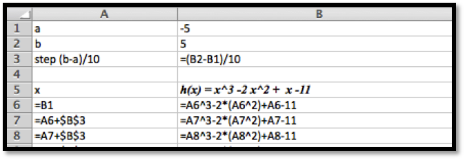
We will walk through the process for producing graphs for three examples of increasing complexity. For the first example we have a specific function and specific range in mind, say over . For the second example, we would like to use parameters in the formula, for example, , with specified values of a, b, and c, and have the ability to easily change the values of the parameters and see the graph. For the third example we would also like to have the ability to change the domain, graphing over \xLow\xHigh, where \xLow and \xHigh can easily be changed.
Figure1.4.8.Video presentation of this example
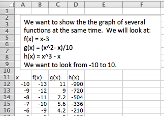
We would also like to put two or more graphs together. For our examples, we will want to use the functions \(f(x) = x – 3\text{,}\) \(g(x) = (x^2 – x)/10\text{,}\) and \(h(x) = x^3 – x\text{.}\) We start by using the procedure given above to make a chart of values for the three functions.
We then simply select the cells for \(x\) and the functions we want graphed together and produce a scatterplot as before. (To graph \(g(x)\) and \(h(x)\) together, we want to select the columns for \(x\text{,}\) \(g(x)\text{,}\) and \(h(x)\text{.}\))
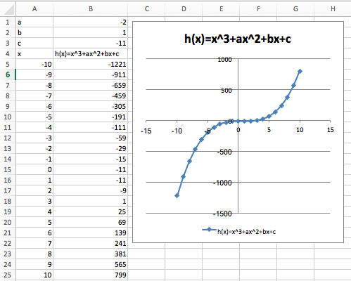
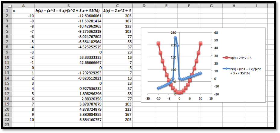
One problem with the graph of \(g(x)\) and \(h(x)\) together is that the functions have different orders of magnitude, so we do not see that \(y = g(x)\) is a parabola. One remedy is to use a secondary axis for the graph of \(h(x)\text{.}\) (Simply double click on one of the points for \(h(x)\text{,}\) and select secondary axis from the axes tab.)
Excel has a lot of ways to add formatting to a graph or chart, many more than we want to be concerned with at this point. We simply point out a few and leave it to the reader to explore how this should be used for a good visual presentation. If you click once on the chart to select it, the Chart tab in the home ribbon, adds sub-tabs for layout and format. With Chart Title, you can add a title to the chart, then edit it. The Axes icon allows you to add titles for the axes. If you select a data point form , you can then use the Data Labels icon to add values next to the points. The chart with these annotations is given below. The rule of thumb to follow is to add enough annotations for a reader to be able to easily understand what is happening in the chart.
It is also worthwhile to note that you can manually set the y-range of a graph by double clicking on the axis and setting the values. This is particularly useful of the function has a vertical asymptote.
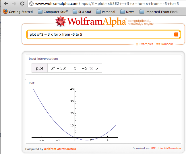
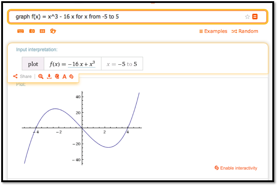
Throughout this book, we are limiting ourselves to mathematical tools that the student can reasonably expect to find in a generic work environment. That is one of the reasons for focusing on using spreadsheets and Excel. A second reason is that we will spend a significant amount of time on functions defined by data points, where we then try to construct a formula. However when we are starting with a formula, there are easier ways to produce a graph. The simplest is to use the free website, Wolfram Alpha. For example to obtain a graph of the functions , as ranges from to , we simply type “plot x^2 – 3 x for x from -5 to 5” and obtain:
Produce a worksheet that with a graph of the function , with going from -10 to 10 by 1. Explain why the graph is inaccurate. (Pay attention to places where there should be asymptotes.)
2* – Extra credit) — Fix the graph from problem 2 by adjusting the set of x-values used.
Produce a worksheet with a graph of for from -10 to 10, where the values of ,, and can be changed and the graph will update automatically. For initial values, use ,, and .
Produce a worksheet with a graph of for x from -10 to 10, where the values of ,, and can be changed and the graph will update automatically. For initial values, use ,, and .
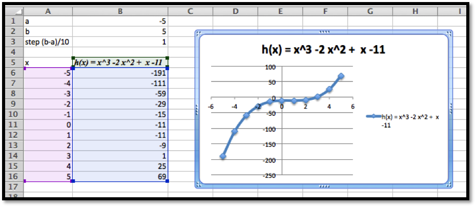
Produce a worksheet with a graph of for going from a to b, where the values of and can be changed and the graph will update automatically. For initial values, use and .
Produce a worksheet with a graph of for going from to , where the values of a and b can be changed and the graph will update automatically. For initial values, use and .
(Writing assignment) Write a report of 2 pages or less on the graph of the function . The report should be in Word (or other word processor) format with at least 2 graphs that illustrate different features by looking at different viewing windows.
Produce a worksheet with graphs of and , for x going from -10 to 10. Use secondary axes so that both graphs use the full plotting window. Adjust the range of values used to make the graph reasonable.
Produce a worksheet with graphs of and , for going from -10 to 10. Add a title to the chart. Do something interesting with the fonts or other options and explain what you did.
Use Wolfram Alpha to produce a graph of , for going from -5 to 5. Use your favorite screen capture software and paste the result into an Excel worksheet.